

The Obama Shift
By Randall Hoven
AmericanThinker.com
If we use terms such as "the new normal" for the economy, what was the old normal? Was there even a "normal," or were things always turbulent or spiraling out of control?
Believe it or not, the federal budget used to have a "normal." It was not spiraling out of control. It was not very turbulent. Life was good...it really was.
Look at this chart. It shows federal government spending and revenues over the four decades of 1968 through 2007. To the eyeball, both 40-year squiggles look about flat. In fact, a statistician would say they are very flat. The dashed lines are the linear regression lines.
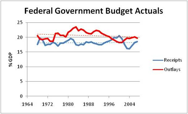
Data source: White House Office of Management and Budget, Table 1.2
How flat are those trend lines? If they continued for an entire century past the midpoint of the above data set, federal spending would be 18.5% of GDP in 2088, and the federal government would be in slight surplus. That is what you call "sustainable."
So yes, there was a "normal." It lasted for forty years. It meant federal revenues of about 18.2% of GDP, rising very slightly, and federal spending of about 20.6% of GDP, falling a bit faster than revenues were rising. That is, all the trends were good - increasing revenues and declining spending and deficits.
(For the advanced student who thinks I cherry-picked the beginning and ending years, here are some sensitivities. Revenues would show a rising trend for any starting year prior to 1977. Spending would show a falling trend for any starting year between 1966 and 1994. Similarly, revenues would show a rising trend for any ending year between 1997 and 2008. Spending would have shown a falling trend for any ending year between 2001 and 2009. In short, the selection of time-span would not have affected the general conclusion that both revenues and spending were virtually flat as percentages of GDP up until 2008.)
Plus, I've said it before and I'll say it again: the "Bush tax cuts" did not demolish this four-decade trend. In fact, they put things back on trend. In 2007, or four years after Bush's second round of tax cuts, federal revenues were 18.5% of GDP (above trend), and spending was 19.7% of GDP (below trend). Everything I'm saying can be verified with the OMB's own numbers. You should pray for the return of 2007.
And what about the economy? Real GDP averaged 3.1% annual growth over those 40 years. (It's grown less that 0.2% annually since then.) That trend was also close to flat: linear regression shows a slightly declining trend that would put the real GDP growth rate at 2.5% by 2088. Another sustainable trend.
As for jobs, you don't want to ask. The U.S. economy added over 68 million jobs in those four decades. (We've lost over 5 million since.)
The time-span above ended with 2007. That was the last fiscal year for which Republicans wrote the federal budget. You might not remember written, passed budgets; there hasn't been one in almost three years. Democrats took over both houses of Congress in 2007 and wrote the budgets for FY 2008 and FY 2009, the exact years spending skyrocketed.
The Democrat-controlled Senate has killed every proposed budget since, leaving unprecedentedly high budgets in place year after year.
Democrats increased spending to a level not seen since the peak of World War II. It has been over 24% of GDP in each and every year of President Obama's term. In 2009 it was over 25%, a level last reached in 1945.
All the above is preamble. Every journey starts with a first step. And every optimal path must start with where we are now. We can't change history; we can only change our future.
So who is offering what? Here is what Obama is offering.
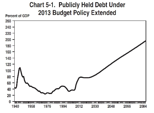
Source: OMB.
Do you see in this chart where Democrats took over both houses of Congress? That would be that sharp bump up in debt in 2008 and 2009. And do you see where it goes from here? Onward and upward until it exceeds the peak reached with World War II and to levels beyond even those experienced by Greece today. And it never declines or even levels out. Such a trend cannot be sustained.
When Democrats speak of "moving forward," they mean up the line on this chart, to Greece and beyond. They mean unsustainable -- predictable unsustainability.
Did I make up this data? No. This chart came straight from Obama's White House. This was the chart put out by the people willing to make the rosiest assumptions they could hope to get away with. This is the best they could come up with!
You might think there is some intricate explanation that would make this chart more palatable to your analytic perspectives. You would be wrong. The explanation, as Treasury Secretary Timothy Geithner gave it, was this. (Enjoy the video.)
You are right to say we're not coming before you today to say we have a definitive solution to that long-term problem. What we do know is, we don't like yours[.]
So "Plan A" is no plan whatsoever. Unless you call purposely going into formal default on someone else's watch a "plan."
Today, as I write, the Republican-led house passed a plan -- Paul Ryan's plan. I want you to look at something.
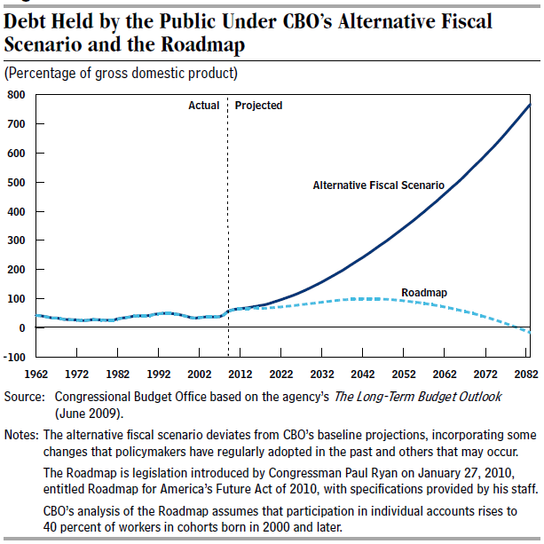
Source: Congressional Budget Office.
This chart was generated by the non-partisan Congressional Budget Office. It shows debt projections, just like the previous chart from the White House. But the CBO's chart compares two plans: the non-plan of leaving things alone, and Paul Ryan's plan. One goes off to infinite debt, the other gets us back to normal.
Could the choice of futures be any starker?
And that choice occurs this year, on November 6. You can vote to become Greece on steroids. Or you can vote for a return to that harsh world we all once knew as "post-war America." Do you want riots and default, or 68 million more jobs?
For real hope, un-change.
Corrected to change a figure from 18.2% to 18.5%.
Randall Hoven can be followed on Twitter.